Twitter sentiment analysis
Analyzing how people felt about remote work during COVID-19 through the #WorkFromHome and #العمل_عن_بعد hashtags, built on MongoDB.
Team project
The problem
When COVID-19 pushed many organizations to remote work, the open question was whether people were happy with it or wanted to go back to the office.
The solution
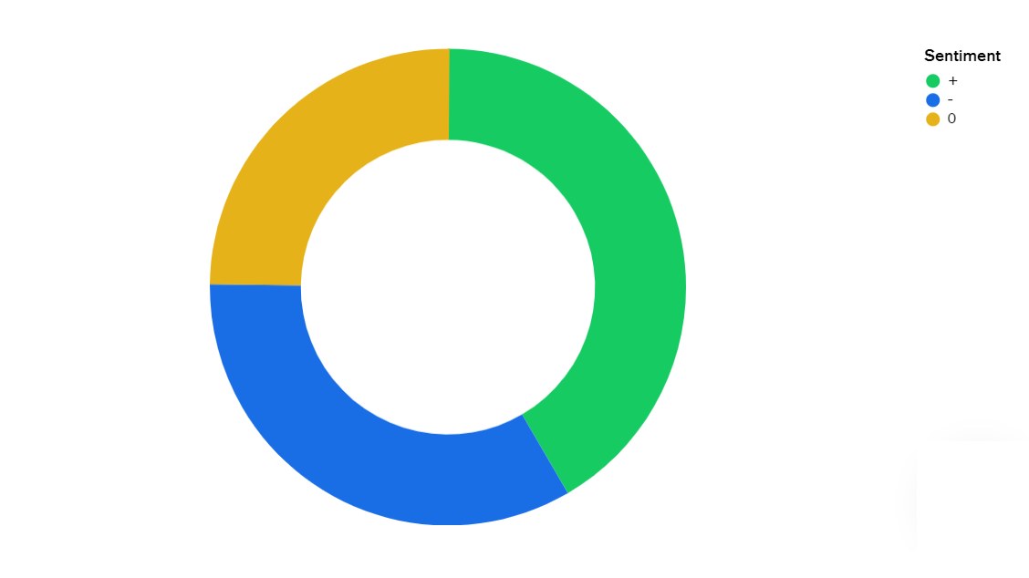
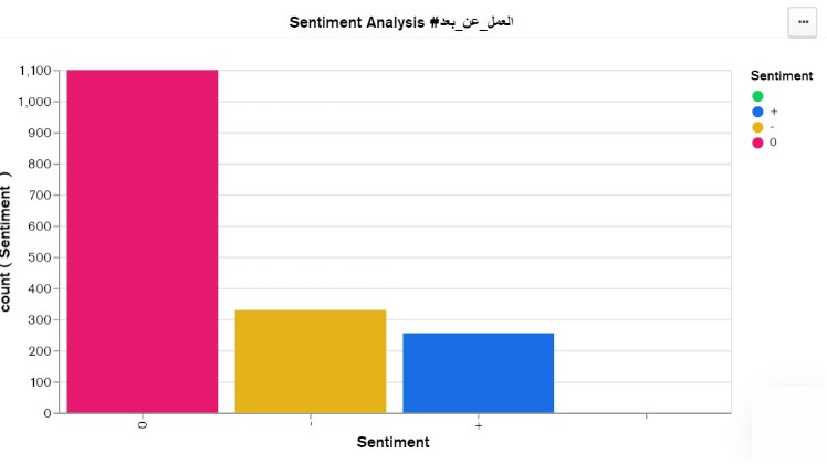
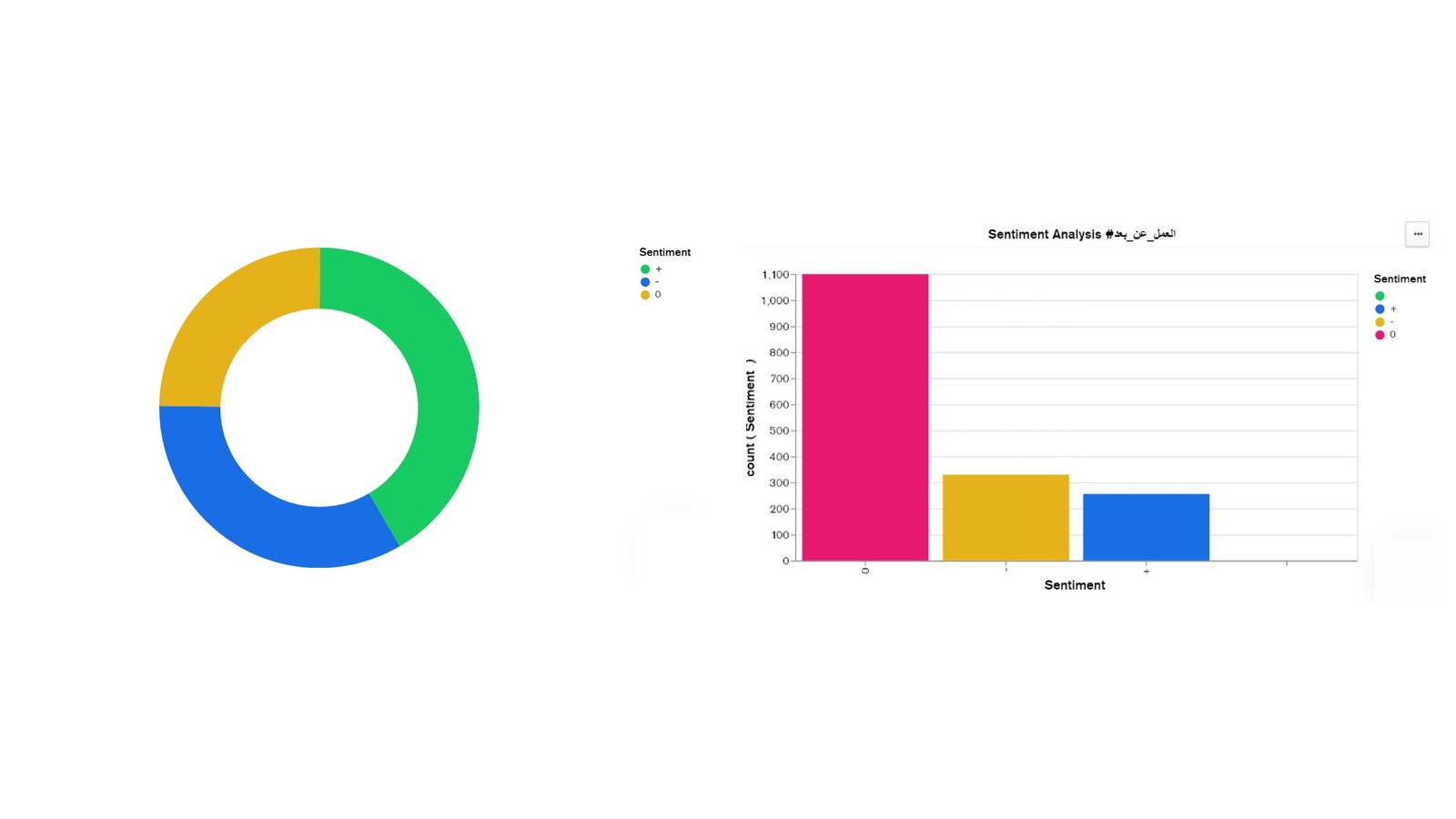
Collect tweets from two remote-work hashtags, store them in MongoDB Atlas, label them by sentiment, and show the results as charts of positive and negative opinion.
How it works
Twitter is a huge source of everyday opinion, so we picked two remote-work hashtags, one English and one Arabic, and labeled the tweets by sentiment to see the share of positive and negative opinions.
The project was built by a team of five over eight days, April 1 to 8, 2020.
How it was built
- Environment: Red Hat Enterprise Linux, then the MongoDB 4.2 server and the Mongo Shell
- Cloud database: a MongoDB Atlas cluster with an IP access list and database users, connected to MongoDB Compass
- Data collection: tweets downloaded by hashtag, unneeded columns removed, then converted to JSON
- Loading: a JavaScript script run from the Mongo Shell to insert the documents into a collection
- Analysis: Python 3, Miniconda, and Jupyter Notebook
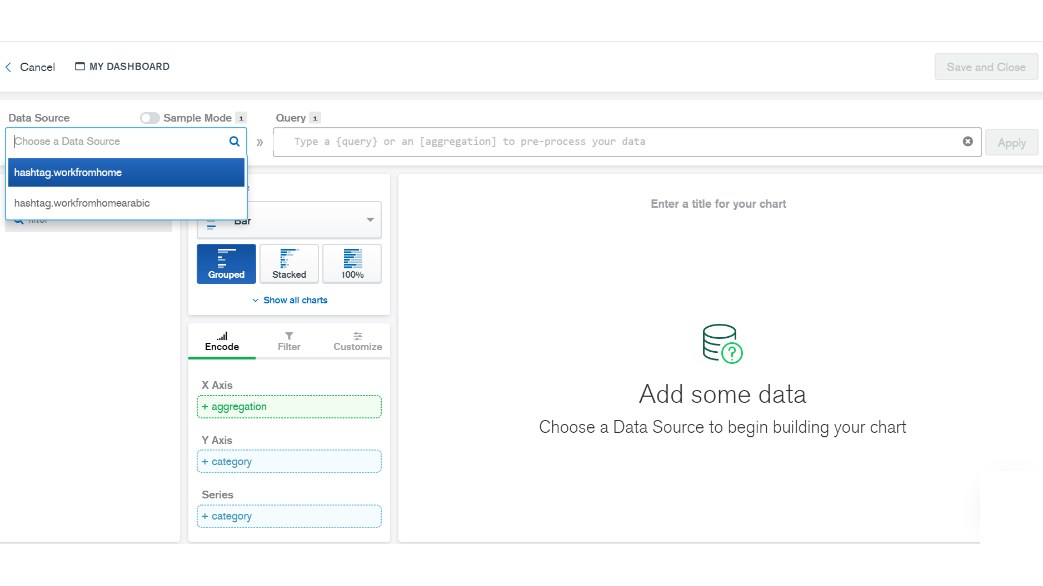
- Visualization: a MongoDB Charts dashboard
Challenges
- Twitter API access: the plan was to stream tweets in real time through the API, but the access request was still under review at the deadline, so we used a web tool to download tweets manually
- Charts in Jupyter: plotting the data we wanted didn't work out in time, so we used Jupyter for analysis and MongoDB Charts for visualization
What I learned
- Always have a plan B ready when the deadline is tight
- The difference between relational (SQL) and non-relational (NoSQL) databases, and how MongoDB stores flexible JSON documents
- The difference between the MongoDB server and the Mongo Shell
- An Atlas cluster has three nodes: one primary that accepts writes and two secondaries holding copies of the data, one of which takes over if the primary fails
Key features
- Tweets collected from one English and one Arabic hashtag
- Data cleaned and converted from spreadsheets to JSON documents
- Data stored in the cloud on MongoDB Atlas
- Database managed and browsed with MongoDB Compass
- Each tweet labeled positive, negative, or unrelated
- Data analyzed in Jupyter Notebook with Python
- Results dashboard built with MongoDB Charts
- Database node performance monitored from the Atlas dashboard
Screenshots